In the context of UC09 of IOT-NGIN ENG and ASM worked together to a dashboard for system operators.
The dashboard is a powerful and versatile tool that connects to ASM providing users with a comprehensive experience of data visualization and analysis.
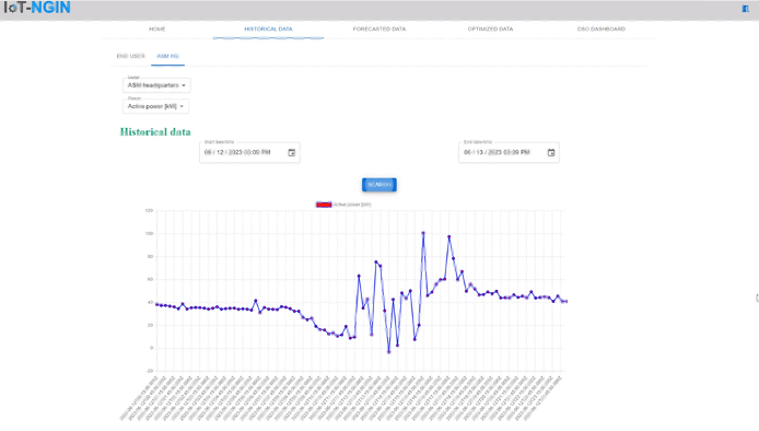
In particular, the visualization dashboard is used to display historical data from IoT sensors used by the DSO and allows the visualization of energy parameters of the electrical network. For example, PMU data, corresponding to a predetermined list of sensors to be displayed, is divided into actual, predicted, and optimized.
The energy and measurement parameters that can be displayed are active power (kW), reactive power (kVAR), and apparent power (kVa).
Therefore, the dashboard is designed to enable users to access real-time data from a variety of sources and utilize forecasting and optimization services. One of the most interesting aspects is the ability to obtain historical data for a specific list of sensors and view them directly on the dashboard.
To access the data, users need to authenticate and log in and then they can select the desired sensor, power type, and time interval of their interest. By clicking on a specific button on the page, the data is processed and displayed on an intuitive graph.
As shown in the image above, the graph displays the timestamps on the x-axis and the corresponding values on the y-axis, allowing users to analyze the data according to their preferences and specific requirements. It is an effective way to identify trends and recognize patterns to make appropriate decisions.
This dashboard represents an excellent resource for those working with data and desiring a simple yet powerful way to visualize and analyze real-time results. The connection to ASM servers ensures reliable and secure communication between the dashboard and the data sources, providing a robust environment for analysis.